# 插件规范
⚠️注意:默认示例项目创建请参考初始化项目
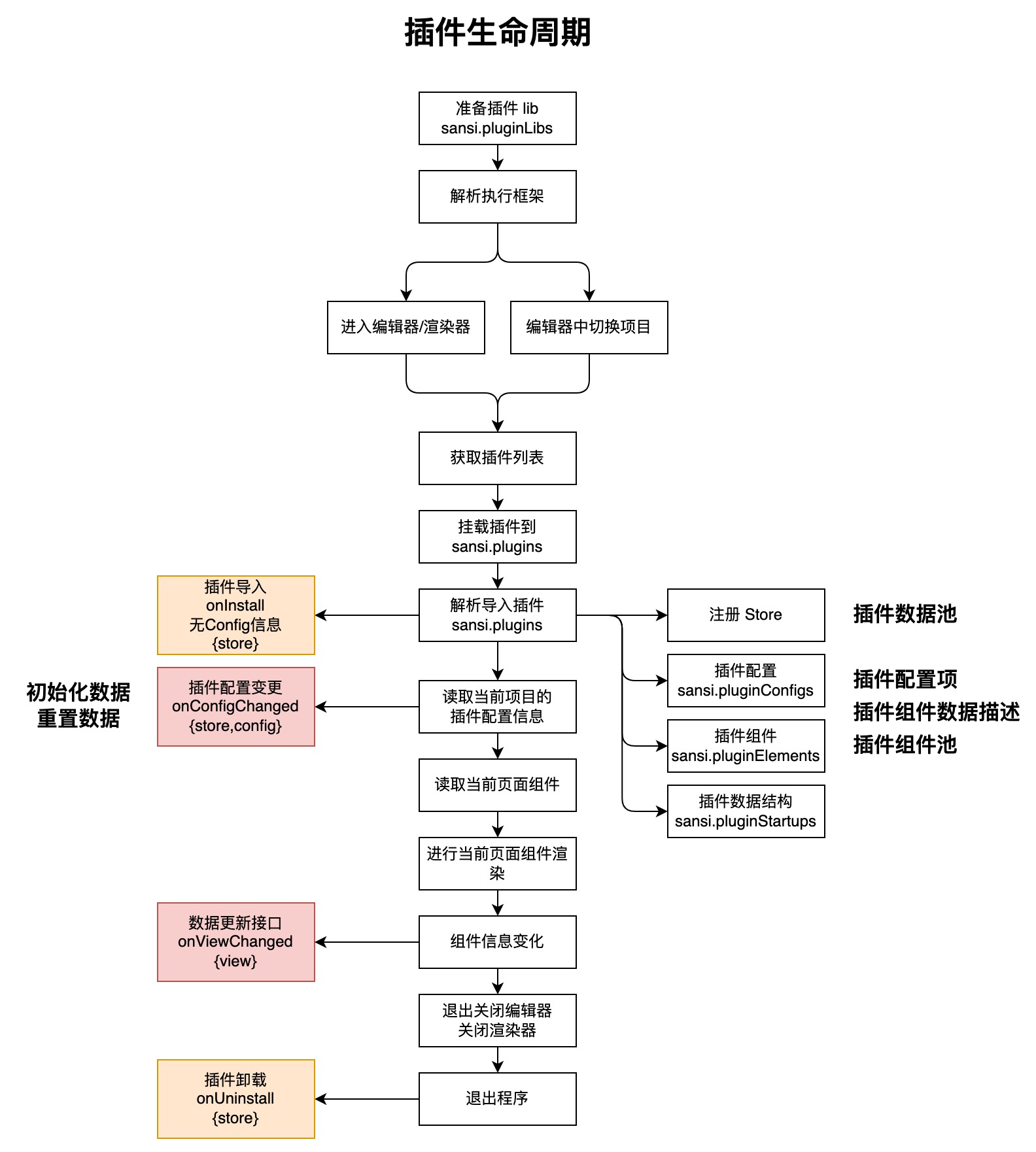
# 生命周期
# 目录结构
插件开发工程目录结构
.
├── main.json  (插件描述文件)
├── public (公共目录)
│   └── icon.png (插件图标)
├── src
│   ├── index.ts (项目入口)
│   ├── views
│   │   ├── PowerButton.vue (插件示例)
│   │   ├── CustomAttrsParserDemoView.vue (自定义插件解析器的示例)
│   │   └── assets  (资源目录)
│   │       ├── btn_off.webp
│   │       └── btn_on.webp
│   ├── attrs
│   │   └── Switch.vue (自定义插件解析器)
│   ├── config
│   │   ├── index.ts  (插件配置声明)
│   │   └── components
│   │       └── Servers.vue (自定义配置组件(可删除))
│   ├── hooks
│   │   └── useVuex.ts  (vuex 辅助工具)
│   ├── locales (国际化翻译,需要 ccs-pro 2.1.0+ 和 sccs 0.4.0+)
│   │   ├── en.js  (英文翻译表)
│   │   ├── zh_CN.js  (中文翻译表)
│   │   └── i18n.ts  (国际化翻译辅助工具)
│   ├── store
│   │   └── index.ts  (vuex 仓库)
│   ├── global.d.ts (数据结构定义)
│   └── vue.d.ts    (数据结构定义)
├── package.json (项目描述文件)
└── tsconfig.json (TS 配置)
# 关键文件/目录说明
| 文件/目录 | 类型 | 说明 |
|---|---|---|
| main.json | 文件 | 插件的描文件,用于声明插件的 ID,名称,版本、描述、图标、入口、样式等相关信息。 |
| public/ | 目录 | 公共目录,用于存储一些公共资源文件,默认会放置一个图标文件。 |
| src/ | 目录 | 项目目录,相关代码和资源。 |
| src/index.ts | 文件 | 插件的入口,用于声明和注册相关组件、数据、配置、以及接收生命周期回调。 |
| src/views/PowerButton.vue | 文件 | 默认的示例组件。 |
| src/views/CustomAttrsParserDemoView.vue | 文件 | 使用插件解析器的示例。 |
| src/views/assets/ | 目录 | 资源文件目录,可以修改到其它位置。 |
| src/attrs/Switch.vue | 文件 | 插件解析器示例 |
| src/config/index.ts | 文件 | 插件配置声明。 |
| src/config/components/ | 目录 | 自定义的配置可视化组件,用于解析编辑默认类型不支持的条目。 |
| src/store/index.ts | 文件 | 插件数据池(vuex)。 |
| src/hooks/useVuex.ts | 文件 | 针对于插件的 vuex 封装,用于处理插件数据池的相关数据。 |
| src/global.d.ts | 文件 | 数据结构定义,一般情况下无需调整。 |
| src/vue.d.ts | 文件 | 数据结构定义,一般情况下无需调整。 |
| package.json | 文件 | 项目描述文件。 |
| tsconfig.json | 文件 | TS 配置。 |
| src/locales/ | 目录 | 国际化翻译文件夹(需要 ccs-pro 2.1.0 及 sccs 0.4.0 以上版本) |
| src/locales/i18n.ts | 文件 | 国际化翻译辅助工具(需要 ccs-pro 2.1.0 及 sccs 0.4.0 以上版本) |
| src/locales/en.js | 文件 | 英文翻译表(需要 ccs-pro 2.1.0 及 sccs 0.4.0 以上版本) |
| src/locales/zh_CN.js | 文件 | 中文翻译表(需要 ccs-pro 2.1.0 及 sccs 0.4.0 以上版本) |
# 描述文件
插件结构中最基本的描述信息是 main.json,其基本结构如下:
{
  "id": "demo",
  "version": "1.0.0",
  "icon": "icon.png",
  "name": "未命名插件",
  "description": "默认描述",
  "entry": [
    "index.js"
  ],
  "style": [
    "index.css"
  ]
}
# 描述文件字段
| 字段 | 类型 | 说明 |
|---|---|---|
| id | string | 插件唯一标识符,可以在初始化项目时自动生成,也可以手动指定。 |
| version | string | 插件版本号,插件发布新版本时,注意修改此处的版本号。 |
| icon | string | 插件图标。 |
| name | string | 插件名称。 |
| description | string | 插件描述。 |
| entry | string[] | 插件入口,一般情况下请保持默认。 |
| style | string[] | 插件样式表,一般情况下请保持默认。 |
# 插件入口
插件整体的入口是 index.ts
import PowerButton from './views/PowerButton.vue';
import CustomAttrsParserDemoView from './views/CustomAttrsParserDemoView.vue';
import Switch from './attrs/Switch.vue'
import { Store } from 'vuex';
import config from '@/config';
import store from '@/store';
import main from '@main';

export default {
  ...main,
  elements: [PowerButton, CustomAttrsParserDemoView],
  // 自定义插件属性解析器(可删除)
  attrsComponents: { 'plg-switch': Switch },
  // 插件数据池(可删除)
  stores: [store],
  config: config,
  // 导入插件时调用
  onInstall({ store }: { store: Store<any> }) {},
  // 卸载插件时调用
  onUninstall(_: { store: Store<any> }) {},
  // 配置变化时调用
  onConfigChanged({ config, store }: { config: any; store: Store<any> }) {
    store.commit(main.id + '#store/setPrefix', config.prefix);
  },
};
⚠️注意:在 export 中引用
...main是为了统一使用main.json中定义的字段,一般情况下保持不变即可。
# 插件入口字段
| 字段 | 说明 |
|---|---|
| elements | 插件的组件,会显示在组件面板中,可以添加到页面,需要符合插件组件规范。 |
| attrsComponents | 自定义组件属性解析器,在插件组件的属性面板中使用,需要符合插件自定义属性解析器规范 |
| stores | 插件数据池,插件加载时会自动注册,需要符合插件数据池规范。 |
| config | 插件配置,支持自定义数据解析器,需要符合插件配置规范。 |
| onInstall | 插件加载时回调,详情参见生命周期。 |
| onUninstall | 插件卸载时回调,详情参见生命周期。 |
| onConfigChanged | 插件配置加载/变化时回调接口,详情参见生命周期。 |
# 插件数据池规范
⚠️注意:
插件数据池使用非强制要求,如果需要使用,请按照 vuex 规范,如果不需要使用,可以移除。
当然,也可以使用其他数据传递方式,例如:
provider & inject以及自定义 hook 实现数据共享。
/src/store/index.ts
export default {
  name: 'store',
  namespaced: true,
  state: {
    power: 'off',
    prefix: '',
  },
  getters: {},
  mutations: {
    changePower: (state, { power }) => {
      state.power = power;
    },
    setPrefix: (state, prefix) => {
      state.prefix = prefix;
    },
  },
  actions: {
    switchPower: ({ state, commit }) => {
      // 此处可以与服务器通信,同步状态
      if (state.power === 'on') {
        commit('changePower', { power: 'off' });
      } else {
        commit('changePower', { power: 'on' });
      }
    },
  },
};
数据池基本遵照 vuex 4.x 的规范,详情请参考 vuex (opens new window),需要注意的是,导出的数据池里面应该包含 name 属性,该属性在后续使用中有重要的作用。
# 插件组件规范
下面是最基本的组件格式需求,相比于标准 vue 组件,需要导出一个 startup 属性并符合插件要求。
<template>
  <div style="width: 100%; height: 100%; background-color: red"></div>
</template>

<script lang="ts" setup>
// 此处写 vue3 的逻辑代码
</script>
<script lang="ts">
export default {
  startup: {
    title: '测测View',
    icon: '',
    init: {
      type: 'demo-view',
      props: {
        frame: { y: 0, x: 0, width: 100, height: 100 },
        attrs: {},
      },
    },
    schema: {
      attrs: [],
    },
  },
};
</script>
# startup 字段说明
| 字段 | 类型 | 说明 |
|---|---|---|
| title | string | 插件显示名称。 |
| icon | string | 插件预览图标。 |
| init | object | 插件初始化结构。 |
| init.type | string | 插件类型,和插件中其他组件的 type 不可重复。 |
| init.props | object | 插件属性。 |
| init.props.frame | object | 插件默认大小。 |
| init.props.attrs | object | 插件自定义的可配置属性,会展示在编辑器右侧属性面板上。 |
| schema | object | 属性辅助解释器。 |
| schema.attrs | object | attrs 属性辅助解释器。 |
插件自定义 attrs 规范请参考附录一:插件可编辑属性格式定义
较为完整的插件组件示例,请参考附录二:完整插件组件示例
也可以通过 sccs 工具创建一个项目后参考其中的示例组件。
# 插件配置规范
插件配置是声明插件配置属性的方式,插件声明的配置信息会以可视化的形式展现在插件的配置菜单中,一个默认的插件配置是这样的:
⚠️注意:其中自定义解析器是可以不提供的,如果没有这方面的需求,可以不提供自定义解析器,直接使用默认解析器即可。
import Servers from "./components/Servers.vue";

// config 原始数据
const data: any = {
  prefix: "插件配置",
  myColor: "",
  servers: [
    {
      type: "server",
      url: "http://127.0.0.1:12409",
      username: "",
      password: ""
    }
  ]
};

// 数据结构声明
const schema: any = [
  {
    component: "card",
    props: {
      header: "基本信息"
    },
    formProps: {},
    fields: [
      {
        name: "prefix",
        component: "input",
        formProps: {
          label: "前缀:"
        },
        inputProps: {}
      },
      {
        name: "myColor",
        component: "color-picker",
        formProps: {
          label: "颜色:"
        },
        inputProps: {}
      },
      {
        name: "servers",
        component: "servers",
        formProps: {
          label: "服务器地址:"
        },
        inputProps: {}
      }
    ]
  }
];

// 自定义的数据解析器
const components = {
  servers: Servers
};

// 导出相关信息
export default {
  data,
  schema,
  components
};
自定义解析器(可选):
<template>
  <div>
    <div v-if="!props.modelValue || !Array.isArray(props.modelValue)" style="color: red">数据类型错误</div>
    <div v-else-if="props.modelValue.length <= 0">
      <ElButton style="width: 100%" @click="addServer">添加服务器</ElButton>
    </div>
    <template v-else>
      <div class="header">
        <span style="width: 40%">服务器地址</span>
        <span style="width: 25%">用户名</span>
        <span style="width: 25%">密码</span>
        <span style="width: 10%">删除</span>
      </div>
      <div v-for="(model, index) of props.modelValue" style="width: 100%; padding: 1px 0">
        <ElInput v-model="model.url" style="width: 40%" size="small"></ElInput>
        <ElInput v-model="model.username" style="width: 25%" size="small"></ElInput>
        <ElInput v-model="model.password" style="width: 25%" size="small"></ElInput>
        <icon name="delete" width="10" height="22" style="width: 10%" class="delete" @click="del(index)"></icon>
      </div>
      <ElButton style="width: 100%" @click="addServer">添加服务器</ElButton>
    </template>
  </div>
</template>

<script setup lang="ts">
import { ElButton, ElInput } from "element-plus";

const props = defineProps(["modelValue", "options"]);
const defaultOptions = [{ label: "v3pro", value: "v3pro" }];
const options = props.options || defaultOptions;

function addServer() {
  props.modelValue.push({
    url: "",
    username: "",
    password: ""
  });
}

function del(index: number) {
  props.modelValue.splice(index, 1);
}
</script>

<style scoped lang="less">
.header {
  width: 100%;

  span {
    padding: 1px;
    display: inline-block;
    text-align: center;
    border: #d3d3d3 1px solid;
  }
}

.delete {
  color: black;

  &:hover {
    color: red;
  }
}
</style>
默认解析器类型:
| component | 支持字段属性 | 说明 |
|---|---|---|
| input | string | 文本输入框 |
| image | string | 图片选择器 |
| select | string | 内容选择器(单选) |
| switch | boolean | 开关按钮 |
| date-picker | string | 日期选择器 |
| time-picker | string | 时间选择器 |
| color-picker | string | 颜色选择器 |
| rate | number | 评分 |
# 插件自定义属性解析器规范
# 1. 定义解析器
自定义属性解析器本质上是一个 vue 组件,如果要自定义属性解析器可以按照如下方式定义,其中原始数据通过 modelValue 传递进来,如果数据有更新,则通过 update:modelValue 发送出去。
属性解析器负责数据解析显示和编辑后发送更新通知,属性解析器不需要知道数据的具体来源和字段名称,例如下面的解析器本质上就是一个接收 boolean 类型的的 switch 组件,可以接受任意的 boolean 类型数据。
src/attrs/Switch.vue
<template>
  <div>
    <el-switch :model-value="props.modelValue" v-bind="$attrs" @change="changed"></el-switch>
  </div>
</template>

<script setup lang="ts">
const props = defineProps(['modelValue']);
const emit = defineEmits(['update:modelValue']);
const changed = (val: boolean) => emit('update:modelValue', val);
</script>
# 2. 声明解析器
定义完解析器如果想要使用使用则还需要在插件的入口处进行声明,例如:
src/index.ts
import PowerButton from './views/PowerButton.vue';
import CustomAttrsParserDemoView from './views/CustomAttrsParserDemoView.vue';
import Switch from './attrs/Switch.vue'
import { Store } from 'vuex';
import config from '@/config';
import store from '@/store';
import main from '@main';

export default {
  ...main,
  elements: [PowerButton, CustomAttrsParserDemoView],
  // 注意此处,声明自定义插件属性解析器
  attrsComponents: { 'plg-switch': Switch },
  stores: [store],
  config: config,
  onInstall({ store }: { store: Store<any> }) {},
  onUninstall(_: { store: Store<any> }) {},
  onConfigChanged({ config, store }: { config: any; store: Store<any> }) {
    store.commit(main.id + '#store/setPrefix', config.prefix);
  },
};
# 3. 使用解析器
使用解析器则需要在 startup.schema.attrs[i].component 里面指定声明的自定义解析器。
src/views/CustomAttrsParserDemoView.vue
<template>
  <div style="width: 100%; height: 100%" :style="myStyle"></div>
</template>

<script lang="ts" setup>
import { computed } from 'vue';

const props = defineProps(['view']);
const attrs = computed(() => props.view.props.attrs || {}); // attrs 属性
const myStyle = computed(() => {
  return attrs.value.red ? { backgroundColor: 'red' } : { backgroundColor: 'blue' };
});
</script>

<script lang="ts">
export default {
  startup: {
    title: '测试View',
    icon: '',
    init: {
      type: 'demo-view',
      props: {
        frame: { y: 0, x: 0, width: 100, height: 100 },
        // 定义属性
        attrs: {
          red: false,
        },
      },
    },
    schema: {
      attrs: [
        {
          name: 'red',
          component: 'plg-switch',	// 指定使用自定义解析器
          label: '背景颜色',
          props: { 'active-text': '红', 'inactive-text': '蓝' },
        },
      ]
    },
  },
};
</script>
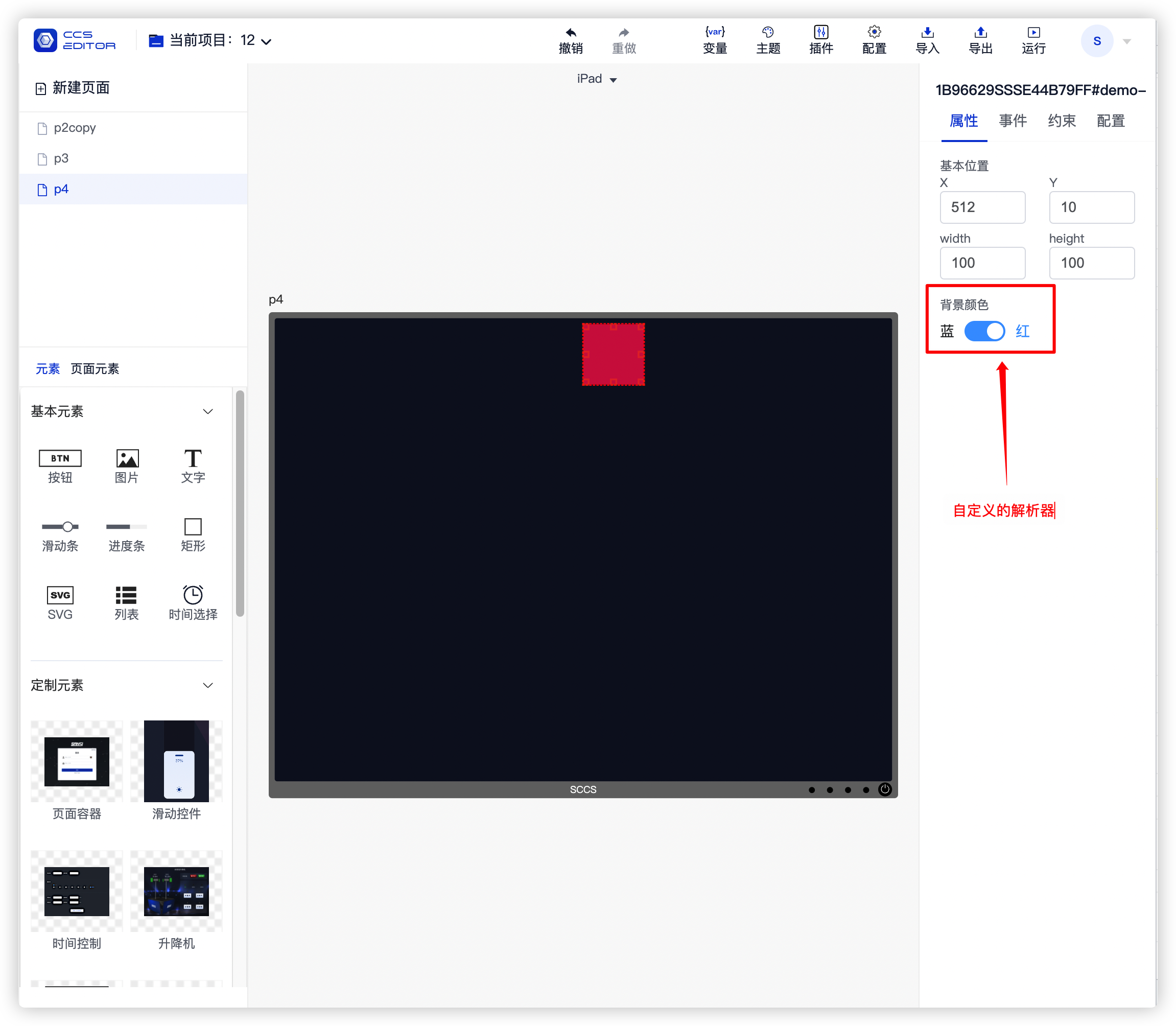
下面是使用该解析器的显示效果:
# 4. 注意事项
# 4.1 插件中声明的解析器优先级要高于默认的解析器
插件中声明的解析器名称如果和内置解析器名称相同,则优先使用插件中的解析器,例如:中控平台提供了一个名为 switch 的解析器,如果在插件中同样声明了一个 switch 的解析器,则在组件的 schema.attrs 中指定了 switch 时会使用插件中声明的那个,而不是使用默认的解析器。
# 4.2 不同插件之间的解析器是不共享
在 A 插件中声明的解析器不可以在 B 插件中使用。
# 插件图片资源引用方式
插件图片资源推荐放置在一个统一的目录下,然后使用相对路径进行引用。
# HTML
 <img src="../assets/img/test.png" alt="" />
 <!--目前不支持下面这种方式-->
 <div style="background-image: url('../assets/img/test.png')" />
# JS
import img from '../assets/img/test.png'
# CSS
.image {
  background-image: url('../assets/img/test.png');
}
# 支持和不支持的引用方式示例
<template>
  <div>
    <!--有效-->
    <img src="../assets/img/test.png" alt="" />
    <div :style="testStyle">有效方式</div>
    <div class="test">有效方式</div>
    <div style="background-image: url('https://abc.com/assets/img/test.png')">有效方式</div>
    <!--无效-->
    <div style="background-image: url('../assets/img/test.png')">无效方式</div>
    <div :style="{ backgroundImage: 'url(' + require('../assets/img/test.png') + ')' }">无效方式</div>
    <div :style="{ backgroundImage: 'url(' + import('../assets/img/test.png') + ')' }">无效方式</div>
  </div>
</template>

<script setup lang="ts">
import test from '../assets/img/test.png';
const testStyle = {
  backgroundImage: 'url(' + test + ')',
  color: 'red',
};
</script>

<style scoped lang="less">
.test {
  background-image: url('../assets/img/test.png');
}
</style>
# 插件更新自身的方式
插件通过调用 onViewChanged 这个 emit 进行更新自身,使用示例如下:
<script setup lang='ts'>
  const props = defineProps(['view']);
  function updateViewData(data) {
    const view = props.view;
    view.data = data;
    emit('onViewChanged', { view });
  }
<script>
# 国际化支持
如果是新项目,可以使用 ccs-pro 2.1.0 以上版本,并安装最新版本的 sccs (0.4.0 以上版本),创建项目,项目中默认带有国际化翻译示例。
如果是旧项目,可以根据以下步骤来升级到支持国际化版本。
# 1. 升级 ccs-pro 和 sccs
升级 ccs-pro 到 2.1.0 以上的版本。
升级 sccs 工具到 0.4.0 以上的版本。
# 2. 添加 i18n 翻译工具
在项目根目录下使用终端输入以下命令安装翻译工具。
npm install vue-i18n -S
# 3. 创建 locales 翻译文件夹
在 src 目录下创建 locales 文件夹,并创建以下文件。
# i18n.ts
import { createI18n } from 'vue-i18n';
import en from './en';
import zh from './zh_CN';

export const i18n = createI18n({
  legacy: false,
  locale: localStorage.getItem('language') || 'zh_CN',
  globalInjection: false,
  messages: {
    zh_CN: zh,
    en: en,
  },
});

// @ts-ignore
export default i18n.global.t;
# en.js
const en = {
  lang: {
    language: 'English'
  },
};
export default en;
# zh_CN.js
const zh = {
  lang: {
    language: '中文'
  },
};
export default zh;
# 4. 组件翻译
组件翻译按照如下方式书写即可。
<template>
  <div class="test">
    <!--1. 在 template 中使用-->
    <div>{{ $t('lang.language') }}</div>
    <div>{{ language }}</div>
  </div>
</template>

<script setup lang='ts'>
// 2. 在 setup 中使用,注意,导入 $t 的位置在下面的 script 中
const language = $t('lang.language')
</script>
<script lang='ts'>
import icon from './assets/btn_on.webp';
import $t from '@/locales/i18n'

export default {
  startup: {
    // 3. 翻译组件名称
    title: $t('lang.language'),
    icon: icon,
    init: {
      id: '',
      type: 'test',
      attrs: {},
      props: {
        frame: {y: 0, x: 0, width: 130, height: 50},
        config: {},
        hideCustomEvent: true, // 隐藏自定义事件
        constraints: [],
        attrs: {
          lang: '',
        },
      },
      children: []
    },
    schema: {
      attrs: [
        // 4. 翻译组件参数
        {name: 'color', component: 'input', label: $t('lang.language')},
      ]
    }
  }
};
</script>

<style scoped lang='less'>
.test {
  color: white;
}
</style>
# 5. 插件名称图标翻译
在 main.json 描述文件中添加 locales 属性,并按照如下格式书写。
{
  "id": "demo",
  "version": "1.0.0",
  "icon": "icon_zh_CN.png",
  "name": "未命名插件",
  "description": "默认描述",
  "locales": {
    "en": {
      "icon": "icon.png",
      "name": "Demo Plugin",
      "description": "Demo Description"
    },
    "zh_CN": {
      "icon": "icon_zh_CN.png",
      "name": "示例插件",
      "description": "默认描述"
    }
  },
  "entry": [
    "index.js"
  ],
  "style": [
    "index.css"
  ]
}
# 5. 其它组件翻译
对于其它文件同样可以导入 locales/i18n 后使用 $t 进行翻译。
# 6. 为什么不支持全局 $t
因为中控平台运行需要多插件同时进行,如果启用全局 $t, 则插件翻译数据需要合并到全局中,目前无法保障插件之间的命名空间和前缀不会产生冲突,因此关闭了全局 $t,以避免误用导致插件间冲突。
目前所有的插件都应该创建自己的局部翻译,并在使用翻译功能前手动导入。
# 附录一:插件可编辑属性格式定义
插件可编辑属性统一放置在 init.props.attrs 中,并通过 schema.attrs 对这些属性进行描述,所有通过 schema 描述的属性均可被中控编辑器的属性面板进行编辑,下面是常用的一些数据类型和对应的描述方式,以及最终在属性面板渲染效果图。
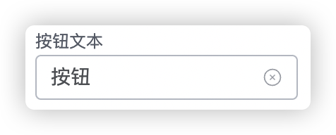
# input
⚠️注意:以下的 startup 结构省略了其余不相关的字段
export default {
  startup: {
    init: {
      props: {
        // 1. 自定义 attrs 属性
        attrs: {
          title: '按钮'
        },
      },
    },
    schema: {
      // 2. 声明 attrs 属性解析器
      attrs: [
        { name: 'title', component: 'input', label: '按钮文本', props: { clearable: true } }
      ]
    }
  }
};
props 属性参考:Input 属性 (opens new window)
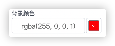
# color
export default {
  startup: {
    init: {
      props: {
        // 1. 自定义 attrs 属性
        attrs: {
          bgColor: ''
        },
      },
    },
    schema: {
      // 2. 声明 attrs 属性解析器
      attrs: [
        { name: 'bgColor', component: 'color', label: '背景颜色', props: {} }
      ]
    }
  }
};
props 属性参考:color 属性 (opens new window)
# pixel
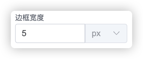
export default {
  startup: {
    init: {
      props: {
        // 1. 自定义 attrs 属性
        attrs: {
          bdWidth: ''
        },
      },
    },
    schema: {
      // 2. 声明 attrs 属性解析器
      attrs: [
        { name: 'bdWidth', component: 'pixel', label: '边框大小', props: {} }
      ]
    }
  }
};
props 属性参考:Input 属性 (opens new window)
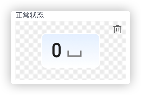
# image
export default {
  startup: {
    init: {
      props: {
        // 1. 自定义 attrs 属性
        attrs: {
          normalImage: '',
          activedImage: ''
        },
      },
    },
    schema: {
      // 2. 声明 attrs 属性解析器
      attrs: [
        { name: 'normalImage', component: 'image', label: '正常状态', suggest: 'NORMAL', { useSmartLink: true, useSmartSize: true } },
        { name: 'activedImage', component: 'image', label: '激活状态', suggest: 'ACTIVE', { useSmartLink: true, useSmartSize: true } },
      ]
    }
  }
};
props 属性参考:
| 属性 | 说明 | 类型 | 可选值 | 默认值 |
|---|---|---|---|---|
| useSmartLink | 是否启用自动链接(需要 suggest 属性支持) | boolean | — | false |
| useSmartSize | 是否根据图片自动重设大小 | boolean | — | false |
suggest 属性支持的参数(枚举)
| 参数 | 示意 | 对应后缀 |
|---|---|---|
| NORMAL | 正常、健康 | ['_n.', '_normal.', '_health.', '_zc.'] |
| ACTIVE | 激活 | ['_a.', '_active.'] |
| SELECTED | 选中 | ['_s.', '_select.', '_selected.'] |
| DISABLED | 禁用 | ['_d.', '_disable.', '_disabled.'] |
| UNBIND | 未绑定 | ['_unbound.', '_unbind.', '_none.'] |
| WARING | 警告 | ['_warn.', '_waring.', '_yc.'] |
| ERROR | 错误 | ['_error.', '_abnormal.', '_gz.'] |
| UNKNOWN | 未知 | ['_unknown.', '_wz.'] |
推荐使用的的 suggest 组合类型的后缀组。
// 按钮 btn_n.png、btn_s.png、btn_a.png、btn_d.png
// 按钮 btn_normal.png、btn_selected.png、btn_active.png、btn_disabled.png
// 健康管理 health_zc.png、health_yc.png、health_gz.png、health_wz.png、health_none.png
// 健康管理 health_normal.png、health_warn.png、health_error.png、health_unknown.png、health_unbind.png
已知按钮中图片具有四种状态(正常、激活、选择、禁用),这四种状态是存在关联的,正常情况下绑定按钮需要连续绑定四次,本方案用于优化类似于按钮等组件的绑定逻辑,可以实现一次绑定多个状态的图片,当然,前提是这一系列图片需要按照指定的规则进行命名。
例如: btn_n.png、btn_s.png、btn_a.png、btn_d.png
之后在对应的 schema attrs 属性处声明对应的 suggest 属性为 'NORMAL', 'ACTIVE', 'SELECTED', 'DISABLED',之后在对应的 props 里面配置 useSmartLink 为 true 即可在选择图片时自动实现状态关联。
# switch

export default {
  startup: {
    init: {
      props: {
        // 1. 自定义 attrs 属性
        attrs: {
          autoCycle: false
        },
      },
    },
    schema: {
      // 2. 声明 attrs 属性解析器
      attrs: [
        { name: 'autoCycle', component: 'switch', props: { 'active-text': '自动轮巡' } }
      ]
    }
  }
};
props 属性参考: switch 属性 (opens new window)
| 属性 | 说明 | 类型 | 可选值 | 默认值 |
|---|---|---|---|---|
| exchangeWidthHeight | 属性变动后自动交换宽高 | boolean | — | true |
使用该属性可以在 switch 状态变更后自动切换视图的宽高属性。
# select
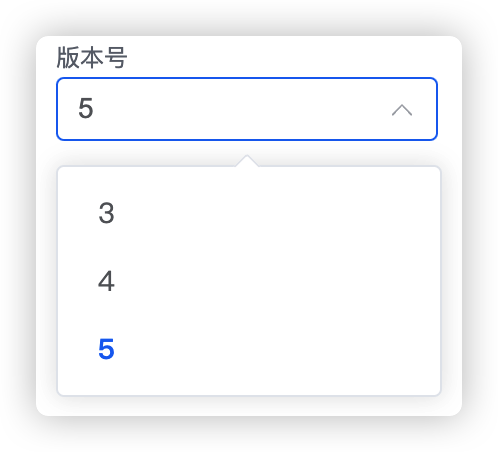
export default {
  startup: {
    init: {
      props: {
        // 1. 自定义 attrs 属性
        attrs: {
          version: '5'
        },
      },
    },
    schema: {
      // 2. 声明 attrs 属性解析器
      attrs: [
        { name: 'version', component: 'select', label: '版本号', props: { options: ['3', '4', '5'] } }
      ]
    }
  }
};
props 属性参考: select 属性 (opens new window)
# font-size
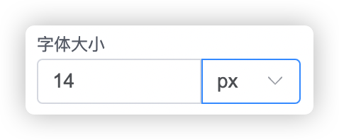
export default {
  startup: {
    init: {
      props: {
        // 1. 自定义 attrs 属性
        attrs: {
          fontSize: '14px'
        },
      },
    },
    schema: {
      // 2. 声明 attrs 属性解析器
      attrs: [
        { name: 'fontSize', component: 'font-size', label: '字体大小', props: {} }
      ]
    }
  }
};
props 属性参考:Input 属性 (opens new window)
# alignment
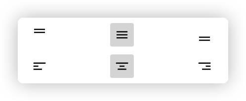
居中属性,用于确定内容的居中特性。
声明属性:
export default {
  startup: {
    init: {
      props: {
        // 1. 自定义 attrs 属性
        attrs: {
          alignment: ['center', 'center']
        },
      },
    },
    schema: {
      // 2. 声明 attrs 属性解析器
      attrs: [
        { name: 'alignment', component: 'alignment' }
      ]
    }
  }
};
使用属性:
省略了大多数逻辑,仅保留核心内容
<template>
  <div class="text" :style="[itemStyle]"></div>
</template>
<script lang="ts">
export default {
  setup(props: any) {
    const itemStyle = computed(() => ({
      '--align-item': attrs.value.alignment?.[1] ?? 'center',
      '--justify-content': attrs.value.alignment?.[0] ?? 'center'
    }));

    return {
      itemStyle
    };
  }
};
</script>

<style lang="less" scoped>
.text {
  position: relative;
  width: 100%;
  height: 100%;
  overflow: hidden;
  display: flex;
  justify-content: var(--justify-content);
  align-items: var(--align-item);
  text-align: var(--justify-content);
}
</style>
# font-bold | font-italic | font-underline
本组属性用于控制字体的样式。
声明属性:
export default {
  startup: {
    init: {
      props: {
        // 1. 自定义 attrs 属性
        attrs: {
          bold: false,
          italic: false,
          underline: false
        },
      },
    },
    schema: {
      // 2. 声明 attrs 属性解析器
      attrs: [
        {
          name: 'bold',
          component: 'font-bold',
          style: { display: 'inline-flex', justifyContent: 'start', width: '33%' }
        },
        {
          name: 'italic',
          component: 'font-italic',
          style: { display: 'inline-flex', justifyContent: 'center', width: '34%' }
        },
        {
          name: 'underline',
          component: 'font-underline',
          style: { display: 'inline-flex', justifyContent: 'flex-end', width: '33%' }
        }
      ]
    }
  }
};
使用属性:
省略了大多数逻辑,仅保留核心内容
<template>
  <div class="text" :style="[itemStyle]"></div>
</template>
<script lang="ts">
export default {
  setup(props: any) {
    const itemStyle = computed(() => ({
      '--bold': attrs.value.bold ? 'bold' : 400,
      '--italic': attrs.value.italic ? 'italic' : 'initial',
      '--underline': attrs.value?.underline ? 'underline' : 'none'
    }));

    return {
      itemStyle
    };
  }
};
</script>

<style lang="less" scoped>
.text {
  position: relative;
  width: 100%;
  height: 100%;
  overflow: hidden;
  display: flex;
  font-weight: var(--bold);
  font-style: var(--italic);
  text-decoration: var(--underline);
}
</style>
# font-family
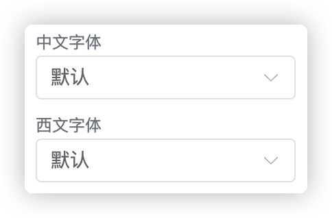
用于定义字体属性。
声明属性:
export default {
  startup: {
    init: {
      props: {
        // 1. 自定义 attrs 属性
        attrs: {
          latinFamily: '',
          asianFamily: ''
        },
      },
    },
    schema: {
      // 2. 声明 attrs 属性解析器
      attrs: [
        { name: 'asianFamily', component: 'font-family', label: '中文字体' },
        { name: 'latinFamily', component: 'font-family', label: '西文字体' }
      ]
    }
  }
};
使用属性:
省略了大多数逻辑,仅保留核心内容
<template>
  <div class="text" :style="[itemStyle]"></div>
</template>
<script lang="ts">
export default {
  setup(props: any) {
    const itemStyle = computed(() => {
      // 字体加载
      let family = '';
      if (attrs.value?.latinFamily) family += attrs.value?.latinFamily + ','; // 西文字体
      if (attrs.value?.asianFamily) family += attrs.value?.asianFamily + ','; // 中文字体
      if (family) family += 'serif'; // 默认字体
      return {
        '--family': family
      };
    });

    return {
      itemStyle
    };
  }
};
</script>

<style lang="less" scoped>
.text {
  position: relative;
  width: 100%;
  height: 100%;
  overflow: hidden;
  display: flex;
  font-family: var(--family);
}
</style>
# padding
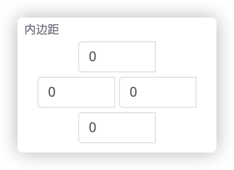
padding 属性用于处理内边距。
声明属性:
export default {
  startup: {
    init: {
      props: {
        // 1. 自定义 attrs 属性
        attrs: {
          padding: [0, 0, 0, 0]
        },
      },
    },
    schema: {
      // 2. 声明 attrs 属性解析器
      attrs: [
         { name: 'padding', component: 'padding', label: '内边距' }
      ]
    }
  }
};
使用属性:
省略了大多数逻辑,仅保留核心内容
<template>
  <div class="text" :style="[itemStyle]"></div>
</template>
<script lang="ts">
export default {
  setup(props: any) {
    const itemStyle = computed(() => ({
      padding: attrs.value.padding ? attrs.value.padding.join('px ') + 'px' : '',
    }));

    return {
      itemStyle
    };
  }
};
</script>

<style lang="less" scoped>
.text {
  position: relative;
  width: 100%;
  height: 100%;
  overflow: hidden;
  display: flex;
}
</style>
# button-emit
export default {
startup: {
init: {
props: {
// 1. 自定义 attrs 属性
attrs: {},
},
},
schema: {
// 2. 声明 attrs 属性解析器
attrs: [
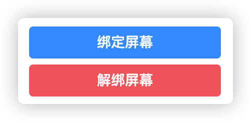
{ component: 'button-emit', props: { name: '绑定屏幕', action: 'bindScreen', type: 'primary' } },
{ component: 'button-emit', props: { name: '解绑屏幕', action: 'unbindScreen', type: 'danger' } },
]
}
}
};
接收 emit 事件:
<script setup lang="ts">
  const { proxy }: any = getCurrentInstance();
  onMounted(() => proxy.$mitt.on(props.view.props.id, emitAction));
  onBeforeUnmount(() => proxy.$mitt.off(props.view.props.id, emitAction));

  function emitAction(event: any) {
    if (event === 'bindScreen') showBindDialog();
    else if (event === 'unbindScreen') tryUnbind();
  }
</script>
props 属性参考: button 属性 (opens new window)
# 附录二:完整插件组件示例
展示了插件组件可以使用的一些基本功能:
- 组件代码结构
- 组件自定义样式
- 组件数据池的使用
- 配置面板和组件之间的数据联动
由于需要演示内容较多,所以代码逻辑比较长,但其中部分功能不是必须的,在实际使用中可以根据需求进行裁剪。
<template>
  <div :style='btnStyle' class='my-btn'
       @click.stop='switchPower'>
    <div style='width: 100%; line-height: 100%; text-align: center'>{{ text }}</div>
  </div>
</template>

<script setup lang='ts'>
import { ElMessage } from 'element-plus';
import { useActions, useState } from '@hooks/useVuex';
import { computed, getCurrentInstance, onBeforeUnmount, onMounted } from 'vue';

// region 外部参数 ------------------------------------------------------------
const props = defineProps(['view', 'edit_mode']);
const states = useState('store', ['power', 'prefix']);
const { switchPower } = useActions('store', ['switchPower']);
// endregion

// region 内容样式 ------------------------------------------------------------
const text = computed(() => states.prefix.value + '-' + (states.power.value === 'on' ? '关' : '开'));

import btn_on_n from './assets/btn_on.webp';
import btn_off_n from './assets/btn_off.webp';

const btnStyle = computed(() => {
  const attrs = props.view?.props?.attrs;
  const bgOnImg = attrs?.powerOnImage || btn_on_n;
  const bgOffImg = attrs?.powerOffImage || btn_off_n;
  const bgImg = states.power.value === 'on' ? bgOffImg : bgOnImg;
  return {
    color: attrs?.color,
    fontSize: attrs?.fontSize || '14px',
    borderColor: attrs?.borderColor,
    borderWidth: attrs?.borderWidth || '0px',
    borderRadius: attrs?.borderRadius || '5px',
    borderStyle: 'solid',
    backgroundColor: attrs?.backgroundColor,
    backgroundImage: `url(${bgImg})`,
    backgroundSize: '100% 100%'
  };
});
// endregion

// region 属性按钮回调 ------------------------------------------------------------
const { proxy } = getCurrentInstance() as any;
onMounted(() => proxy.$mitt.on(props.view.props.id, emitAction));
onBeforeUnmount(() => proxy.$mitt.off(props.view.props.id, emitAction));

function emitAction(event: any) {
  if (event === 'bindDevice') {
    ElMessage.success('绑定按钮被点击了');
  }
}

// endregion
</script>
<script lang='ts'>
import icon from './assets/btn_on.webp';

export default {
  // v3pro button
  name: 'PowerButton',

  startup: {
    title: '开关按钮',
    icon: icon,
    init: {
      id: '',
      type: 'power-button',
      attrs: {},
      props: {
        frame: { y: 0, x: 0, width: 130, height: 50 },
        config: {},
        title: '开关',
        hideCustomEvent: true, // 隐藏自定义事件
        constraints: [],
        attrs: {
          color: '',
          backgroundColor: '',
          borderColor: '',
          fontSize: '14px',
          borderWidth: '0px',
          borderRadius: '5px',
          powerOnImage: '',
          powerOffImage: ''
        },
      },
      children: []
    },
    schema: {
      attrs: [
        { name: 'color', component: 'color', label: '文本颜色' },
        { name: 'backgroundColor', component: 'color', label: '背景颜色' },
        { name: 'borderColor', component: 'color', label: '边框颜色' },
        { name: 'fontSize', component: 'font-size', label: '字体大小' },
        { name: 'borderWidth', component: 'pixel', label: '边框宽度' },
        { name: 'borderRadius', component: 'pixel', label: '边框圆角' },
        { component: 'button-emit', props: { name: '绑定测试', action: 'bindDevice', type: 'primary' } },
        { name: 'powerOnImage', component: 'image', label: '开启状态' },
        { name: 'powerOffImage', component: 'image', label: '关闭状态' }
      ]
    }
  }
};
</script>

<style scoped lang='less'>

.my-btn {
  width: 100%;
  height: 100%;
  position: absolute;
  display: flex;
  align-items: center;

  &:hover {
    opacity: 0.85;
  }

  &:active {
    opacity: 1;
  }
}
</style>
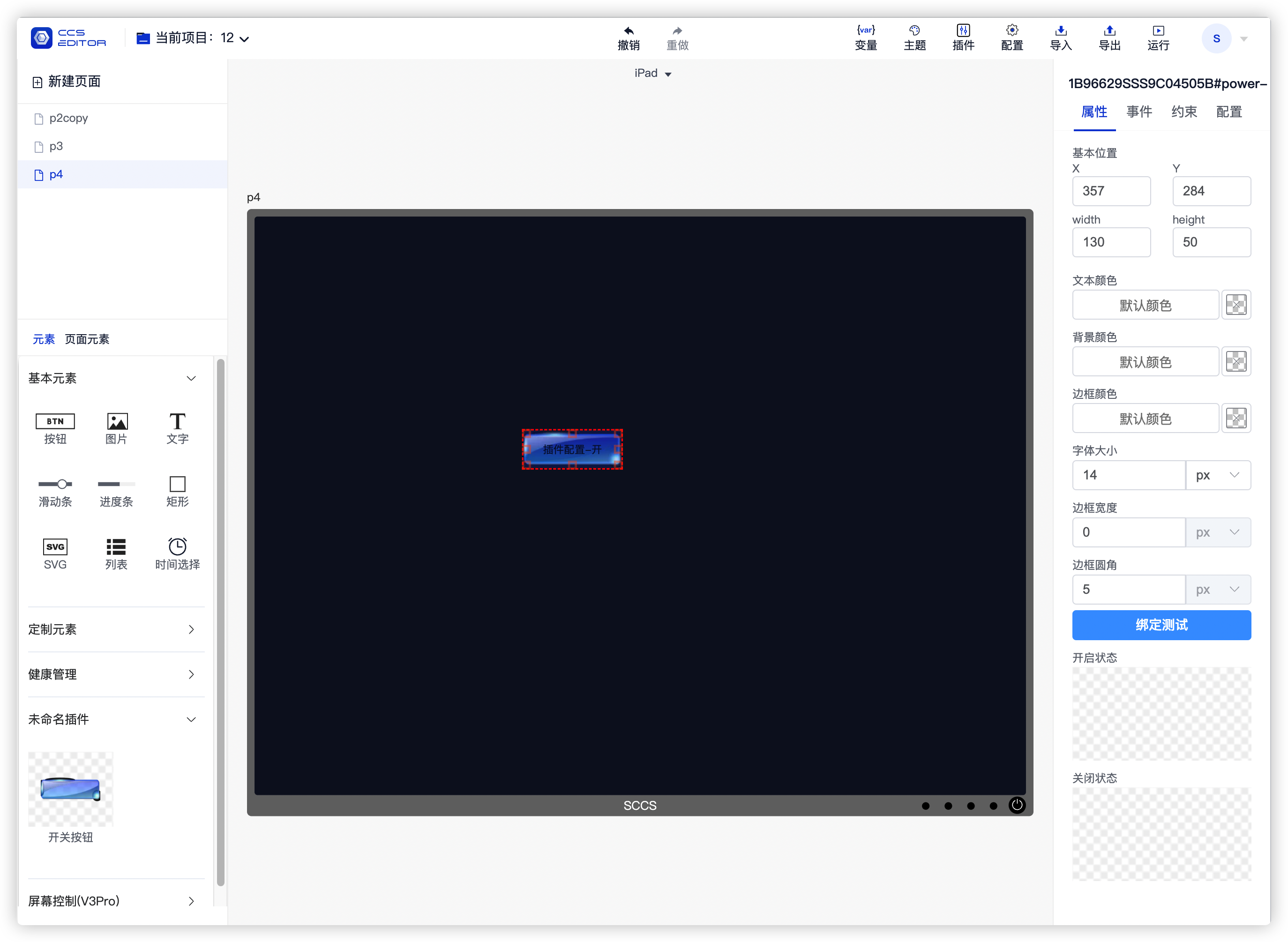
上述组件在中控编辑器中渲染出来是这样的,在左侧会显示插件名称和预览图标,通过拖动添加到中间的编辑区域上, 选中该组件后,即可在右侧的属性面板看到 attrs 定义的相关属性信息。
# 附录三:全局数据
全局数据通过 vue 的 provider 和 inject 方式提供,详情参考:Provide / Inject (opens new window)
标题中带有括号的表示所需最低版本,例如:(2.0.8+) 表示使用该功能最低需要安装中控 2.0.8 版本。
# 1. 获取项目中某一类组件(2.0.8+)
在组件中可能会需要读取当前项目中某一类的组件信息,例如:机柜状态需要获取当前项目中一共有多少个机柜和机柜内容、页面容器控制组件需要获取当前项目中有多少个容器的信息。
具体使用方式如下所示,该示例展示了如何获取当前项目中的所有按钮组件。
const getViewByType = inject<(type: string) => any[]>('getAllViewsByType');
if (getViewByType) {
  const buttons = getViewByType('button')
  console.log(buttons);
}
# 2. 获取当前用户(2.0.8+)
用于获取当前登录用户,包括用户名和权限字段,使用方式如下:
const getCurrentUser = inject<() => { username: string; role: string }>('getCurrentUser');
const user = getCurrentUser();
if (user) {
  console.log('用户名:', user.username);
  if (user.role === 'admin') {
    console.log('角色:管理员');
  } else if (user.role === 'user') {
    console.log('角色:普通用户');
  }
}
# 3. 获取当前项目所有页面(2.0.14+)
获取当前项目所有页面的详细信息:
const pages = inject('pages');
console.log('pages', pages);
# 4. 获取当前页面详情(2.0.14+)
获取当前所在页面的详情:
const currentPage = inject('currentPage');
console.log('currentPage', currentPage);
# 4. 获取当前项目详情(2.0.14+)
获取当前所在项目的详情:
const currentProject = inject('currentProject');
console.log('currentProject', currentProject);
# 附录四: 避免插件样式互相影响
在插件中不同的插件可能会有相同的 class 属性,如果直接写 css 属性,则可能会导致两个不同插件的样式属性互相影响,从而导致效果和预期不一致。
避免插件影响可以使用 scoped 属性,来使样式只在局部生效,但是有部分组件如 table、dialog 等直接使用 scoped 可能会导致样式没有效果,此时需要配合自定义容器 class 和 deep 属性来避免互相影响。
# 处理页面里包含element组件时使用scoped时的样式
# 正常情况下如果页面里想要修改table样式,如下:
如果这时样式加上scoped的话,会发生改不了样式
<template>
    <div class="table-mod">
      <el-table
        :data="[]"
        style="width: 100%"
      >
        <el-table-column
          label="test"
          prop="name"
          width="150"
        ></el-table-column>
      </el-table>
    </div>
</template>
<style lang="less" scoped>
.table-mod{
    .el-table {
      background-color: transparent;
      --el-table-row-hover-bg-color: transparent;
    }
}
</style>
这时只要加上:deep() 就能使代码样式生效
<template>
    <div class="table-mod">
      <el-table
        :data="[]"
        style="width: 100%"
      >
        <el-table-column
          label="test"
          prop="name"
          width="150"
        ></el-table-column>
      </el-table>
    </div>
</template>
<style lang="less" scoped>
:deep(.table-mod){
    .el-table {
      background-color: transparent;
      --el-table-row-hover-bg-color: transparent;
    }
}
</style>
# 如果弹框是一个组件,正常情况代码如下:
会发现弹框自定义样式不生效
<template>
    <el-dialog class="contain">
       <div>
          这里是弹框内容
       </div>
    </el-dialog>
</template>
<style lang="less" scoped>
.contain{
    .el-dialog__header {
      display: none;
    }
}
</style>
# 这时需要
# 1.给弹框外套一层父级
# 2.给弹框指定根元素
# 3、使用:deep()
# 就能使代码样式生效
<template>
    <div class="div-container">
        <el-dialog
        class="contain"
        :append-to="'.div-container'"
        >
            <div>
                这里是弹框内容
            </div>
        </el-dialog>
    </div>
</template>
<style lang="less" scoped>
:deep(.contain){
    .el-dialog__header {
      display: none;
    }
}
</style>
# 常见问题
# sccs 版本升级后编译报错,TS2580: Cannot find name 'process'
发生错误:  {
  code: 'ERROR',
  error: [TS2580: Cannot find name 'process'. Do you need to install type definitions for node? Try `npm i --save-dev @types/node`.] {
    frame: '\n' +
      '\x1B[7m86\x1B[0m   console.log("process.env.NODE_ENV =", process.env.NODE_ENV);\n' +
      '\x1B[7m  \x1B[0m \x1B[91m                                        ~~~~~~~\x1B[0m\n',
    code: 'PLUGIN_ERROR',
    length: 7,
    loc: {
      file: '/Users/gcssloop/WorkSpace/Sansi/sccs-plugin/sccs-plugin-v3pro/src/views/V3PowerButton.vue?vue&type=script&setup=true&lang.ts',
      line: 86,
      column: 41
    },
    pos: 0,
    pluginCode: 'TS2580',
    plugin: 'Typescript',
    hook: 'generateBundle'
  },
...
}
解决方案:按照提示运行 npm i --save-dev @types/node 即可。
# 脚本编辑组件属性问题
脚本修改组件样式不知道组件有哪些属性,脚本中打印that即可查看页面中所有组件的属性。
console.log(that)